Weekend Festival
︎︎︎ rebranding [리브랜딩]
︎︎︎ brand identity [브랜드 아이덴티티]
︎︎︎ rebranding [리브랜딩]
︎︎︎ brand identity [브랜드 아이덴티티]
︎︎︎ music festival [음악 페스티벌]
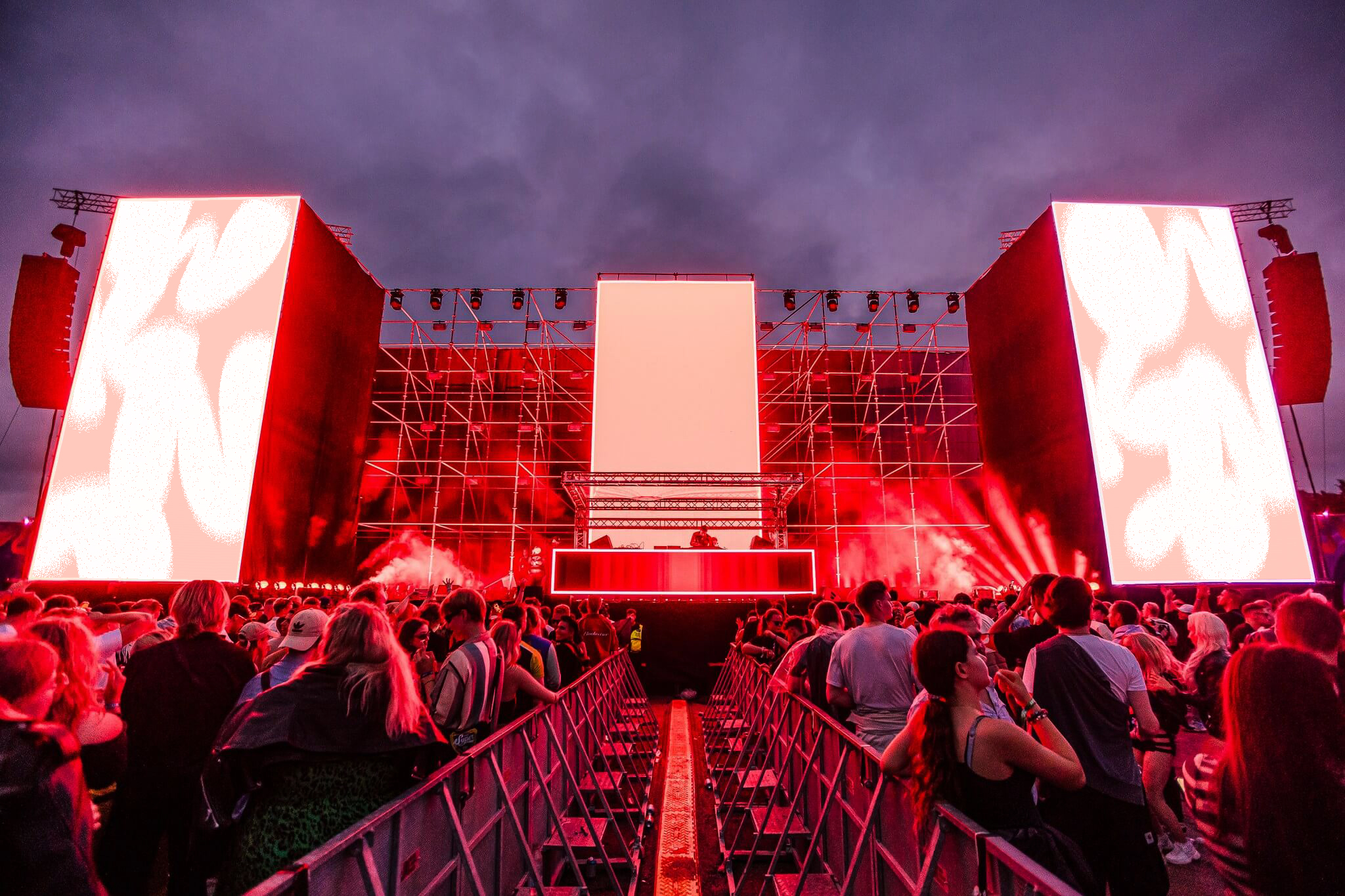
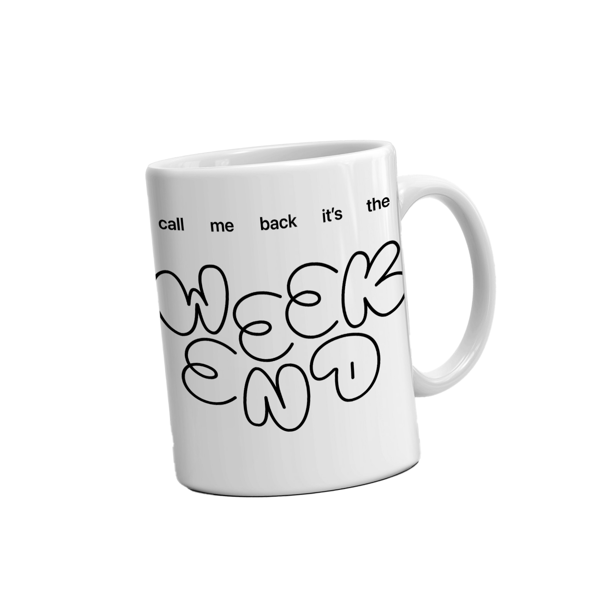
Weekend Festival is the largest music festival in Northern Europe, and it presents individuals with the opportunity to get away from their daily lives. As per visual elements, I've applied contrast to display a comparison between life's dullness and the festival’s excitement. This is shown through the combination of ordinary sans-serif and bubbly typefaces and the usage of a neon-green color on a white background. Furthermore, the objects and quotes on the posters and billboard amplify the Weekend’s feeling of joy for its attendees.
Weekend Festival은 북유럽 최대 규모의 음악 페스티벌로, 사람들에게 일상에서 벗어나 자유를 만끽할 기회를 선사합니다. 시각적 대비를 활용해 반복되는 일상의 무료함과 페스티벌의 설렘을 나란히 보여주었습니다. 이 대비는 평범한 산세리프체와 통통 튀는 서체의 조합, 깔끔한 흰 배경 위 네온 그린의 색 조합으로 나타납니다. 또한 포스터와 빌보드 광고에 담긴 오브젝트와 문구는 관객들이 느끼는 Weekend의 즐거움을 한층 끌어올립니다.
Weekend Festival은 북유럽 최대 규모의 음악 페스티벌로, 사람들에게 일상에서 벗어나 자유를 만끽할 기회를 선사합니다. 시각적 대비를 활용해 반복되는 일상의 무료함과 페스티벌의 설렘을 나란히 보여주었습니다. 이 대비는 평범한 산세리프체와 통통 튀는 서체의 조합, 깔끔한 흰 배경 위 네온 그린의 색 조합으로 나타납니다. 또한 포스터와 빌보드 광고에 담긴 오브젝트와 문구는 관객들이 느끼는 Weekend의 즐거움을 한층 끌어올립니다.